It is bold. Disruptiveº. Luminous. Exciting. Curious. Transformative. Organic.
It’s unique in its appearance - and it has to be:
"I believe a brand should be a reflection of your core beliefs. At Celonis, we believe that transformation is not a far-off goal, but a constant reality. We designed the Superfluid brand to embody that idea. So it's a big departure design-wise from the typical blues and solids and hard edges that characterize the previous generation of enterprise software. It's full of motion and energy; it's in flux." Brandon Ortiz, VP Content Marketing
For us in product design, this opened up a dilemma: Enterprise user experience typically focuses on productivity. We aim at helping our users get their job done, making their lives easier, and help them achieve their goals efficiently. Usability plays a great role in how successful our users are with Celonis:
“In software engineering, usability is the degree to which a software can be used by specified consumers to achieve quantified objectives with effectiveness, efficiency, and satisfaction in a quantified context of use.” Ergonomic Requirements for Office Work with Visual Display Terminals, ISO 9241-11, ISO, Geneva, 1998.
How does usability go hand in hand with flashy colors and organic shapes?
Research on color psychology has shown the effects of different colors:
- Red, for example, has an aggressive appearance, causing the heart rate to increase, and it triggers the pituitary gland.
- Yellow stands for confidence and warmth, but it is at the same time a signal color used for warning signs.
- Pink is associated with compassion, but the luminous color in our brand also puts viewers in constant alert.
Do we really want to put our users into an almost stress-like state of constant alert?
While this effect may be desired in a marketing scenario, where attention is key, we don’t need to convince our users to use Celonis. They have already chosen to use it.
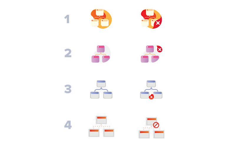
Another important factor of usability is the affordance of UI elements. Well designed buttons literally scream to be clicked, because... well, they look like buttons, they look clickable. Decades of research in human-computer interaction and habituation have led to a set of established UI elements, such as buttons, checkboxes, dropdown menus, etc. that we just recognize. We have formed our mental models of how these mostly box-shaped elements behave and what we can do with them.
Should we now replace them with organic shapes to match the brand?
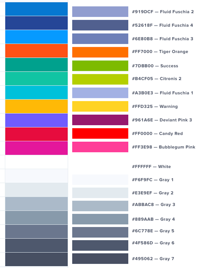
No, we don’t have to. Of course, this doesn’t mean enterprise products havetolook and feel boring and colorless. Often they mainly use the color blue, and so did we until now. Blue is calm and peaceful and does not carry any positive or negative connotations.
However, a nice and deep blue is simply not part of our new superfluid color palette. So what do we do?
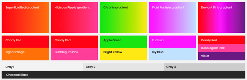
The superfluid brand is dominated by vibrant and emotional gradients.