A histogram is not a bar chart
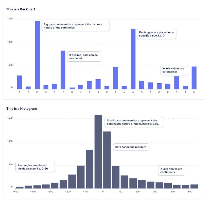
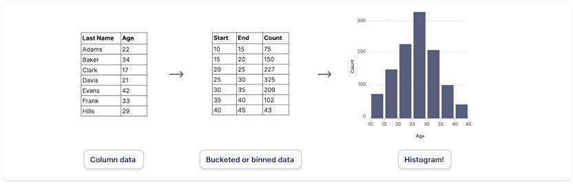
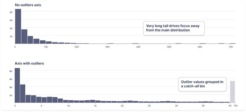
The histogram is a type of graph that helps users understand the distribution of their data. Its appearance is very similar to that of a bar chart, but instead of comparing different categories, a histogram allows you to show the frequency distribution of the data. For this purpose, the data is divided into a series of bars, each bar spans a range of numerical values called a bucket (or bin), and finally the height of the bar represents the frequency of the data falling into each bin. Below you can see the comparison between a histogram and a bar chart.